


It’s important that any text or images of text that appear on your site are a color that sufficiently stands out against the color of your background. This is referred to as color contrast, and WCAG calculates it as a ratio describing the relative luminance of the text and background colors. WCAG dictates that the minimum ratio you must meet is 4.5:1. Remember that, because that’s the magic number.
There’s an algorithm that’s been developed to find this ratio (you can learn it if you want to be a show-off), but you can also access a lot of free resources that will allow you to quickly test your site (more on this in a bit).
There are some notable exceptions to this rule. You don’t need to worry about your site having a color contrast ratio of 4.5:1 in the following situations:
- Large Text. It’s easier to read large text at lower contrast. If the text on your site is at least 18 point or 14 point bold, you only need a minimum contrast ratio of 3:1. This will give you more color choices to choose from when designing your site.
- Incidental Text. Incidental text has no contrast requirement whatsoever. This includes text or images of text that serve a purely decorative purpose, are a part of an image that contains lots of other visual content, are a part of an inactive user interface component, or are invisible to users.
Logotype. There is no contrast requirement for any logos or brand names that may appear on your site.
Colour Contrast Analysers
As I mentioned before, there is a ton of free tools you can use to quickly and easily test the contrast ratio of your site. These are called Colour Contrast Analysers, and you can typically download them as software or browser extensions.
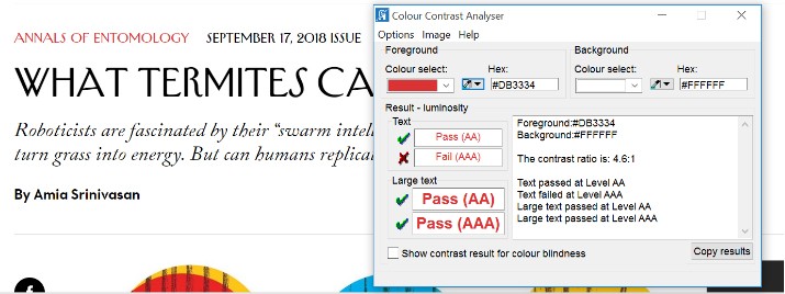
Here’s an example of one at work. Let’s start by opening a Colour Contrast Analyser and going to a webpage. For our purposes, we’ll use this article from the New Yorker.
[Link:]
Other Insights


Contact Us
Monday Loves You
1770 West Berteau Avenue, #206
Chicago, IL 60613
312.973.1112
hi@mondaylovesyou.com
©Duple Meter LLC 2024
Contact Us.
Monday Loves You
1770 West Berteau Avenue, #206
Chicago, IL 60613
312.973.1112
hi@mondaylovesyou.com